Sefam Australia
A leading European brand needed a cut-through campaign for its local launch. The difference was Starck.
Website Development
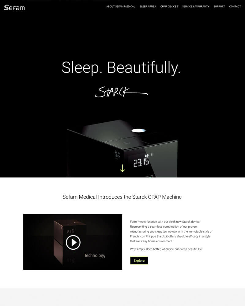
Sefam Australia launched with a CPAP machine unlike any other, one developed by famed industrial designer Philippe Starck. We developed the campaign line ‘Sleep. Beautifully’, then rolled out a website in minimalist style befitting this theme: black, white, with the iconic ‘Starck’ logo and subtle green highlights, in contrast to the Sefam European manufacturer’s site.
Point-of-Sale Posters
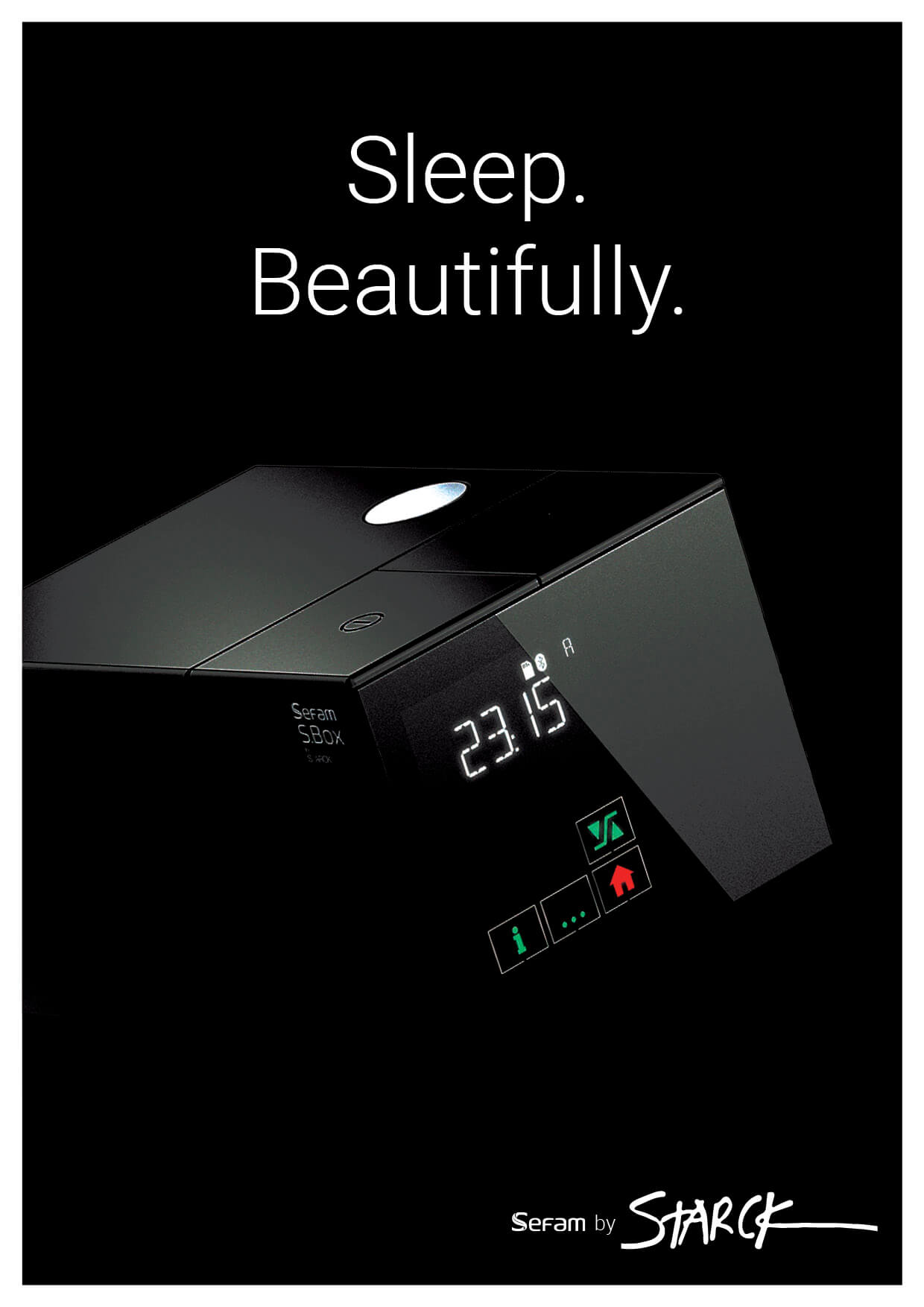
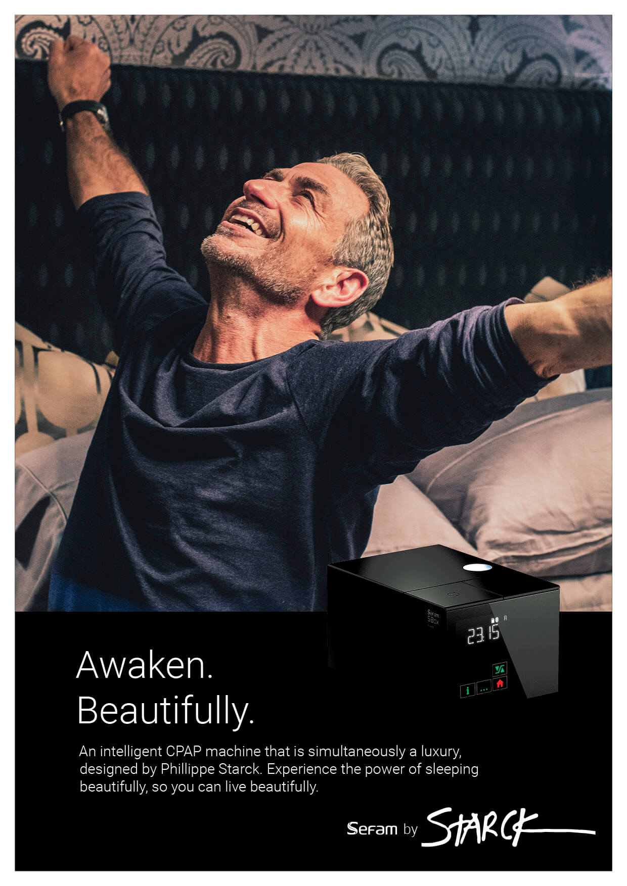
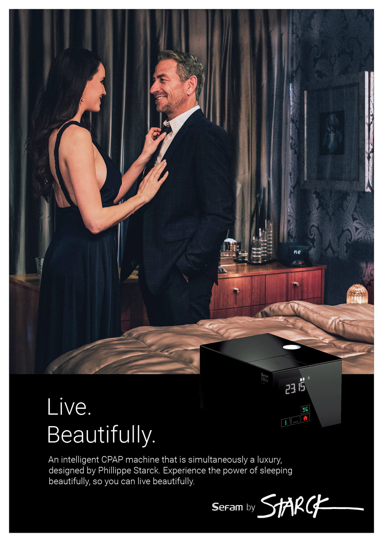
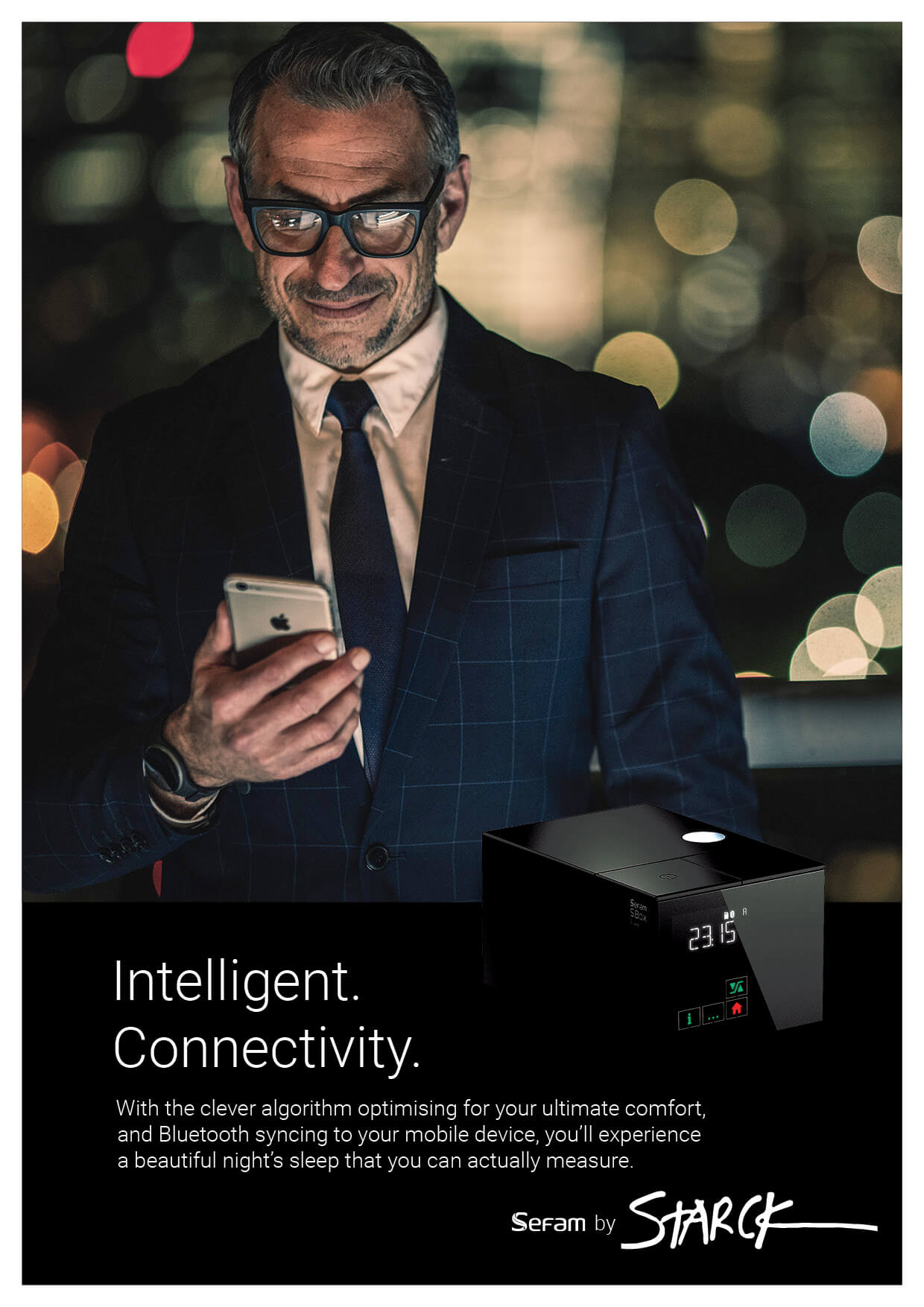
In conjunction with a Sefam Medical partner directing the photoshoot, we developed posters to expand upon the ‘Sleep Beautifully’ line – from product-centric to lifestyle benefit posters. The set drew on the black, minimalist style to contrast with competitors’ more traditional white and product-centric posters often found at point-of-sale, offering real cut-through.
Hero Poster
This poster was designed to introduced the customer to the presence of a new brand in market, a viable, European alternative to the dominant local incumbent.
Brochure
A double-gatefold DL immediately set a different tone, opening from the minimalist cover to aspirational lifestyle photography covering both product in situ, and the benefits of better sleep. Internally, we drew heavily on the Starck factor and offered minimal product details focused on key consumer insights. The overall effect was one of beautiful simplicity, absent the many detailed graphs, tables, and figures which present somewhat awkwardly in competitors’ consumer material.

Quick Start Guide
A creative solution to a branding problem
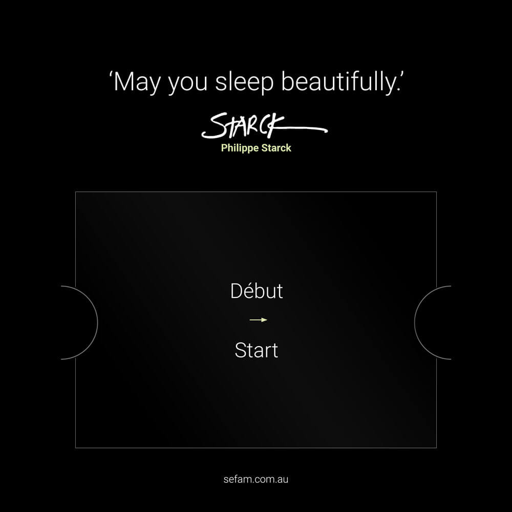
The shipment box and instruction manual were necessarily maintained in the European manufacturer’s standard branding. In order to tie the experience back to the localised marketing material, we presented a ‘Starck-branded’ Quick Start Guide. This was an 8-page gatefold nested inside a heavy card greeter, placed on top of the product inside the box, with a ‘personal message’ from Starck to complete the experience.
